Caladenia Skin
Caladenia Skin is an Australian private dermatology clinic pioneering in non-invasive treatments and organic skincare products.
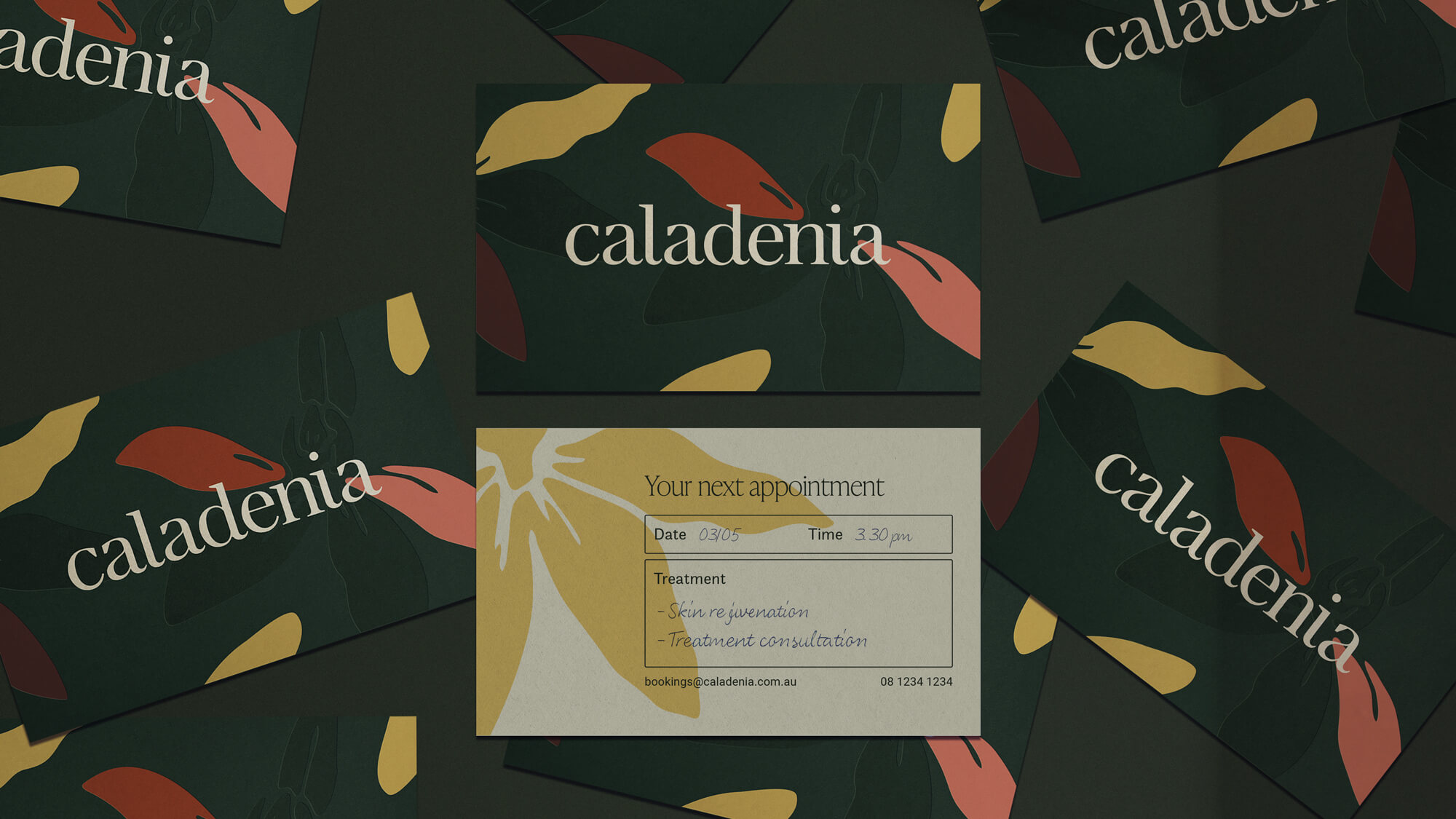
The brand identity makes reference to the sugar orchid (caladenia saccharata), a dainty and pearlescent flower endemic to Australia – the name caladenia being derived from the Ancient Greek kalos, meaning beautiful.
It alludes to the delicate nature of skin, the locality of the clinic, and the native botanicals that define the Caladenia product line.
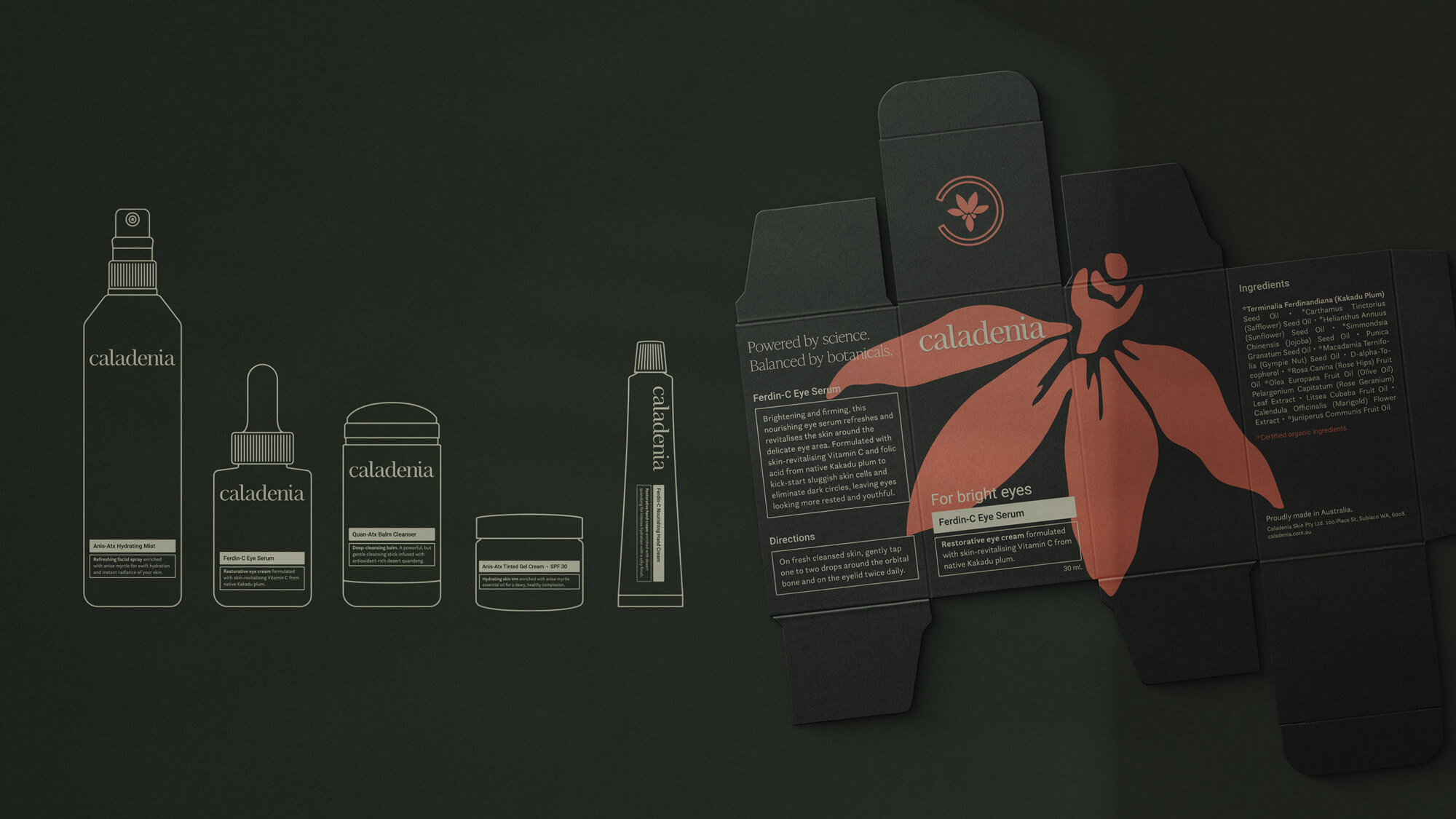
The packaging design focuses on a minimal and tactile experience. In line with Caladenia’s sustainability-driven ethos, the packaging is intended to be reusable and sustainable where possible, featuring frosted green glass, matte aluminium, and uncoated recyclable cardstock.
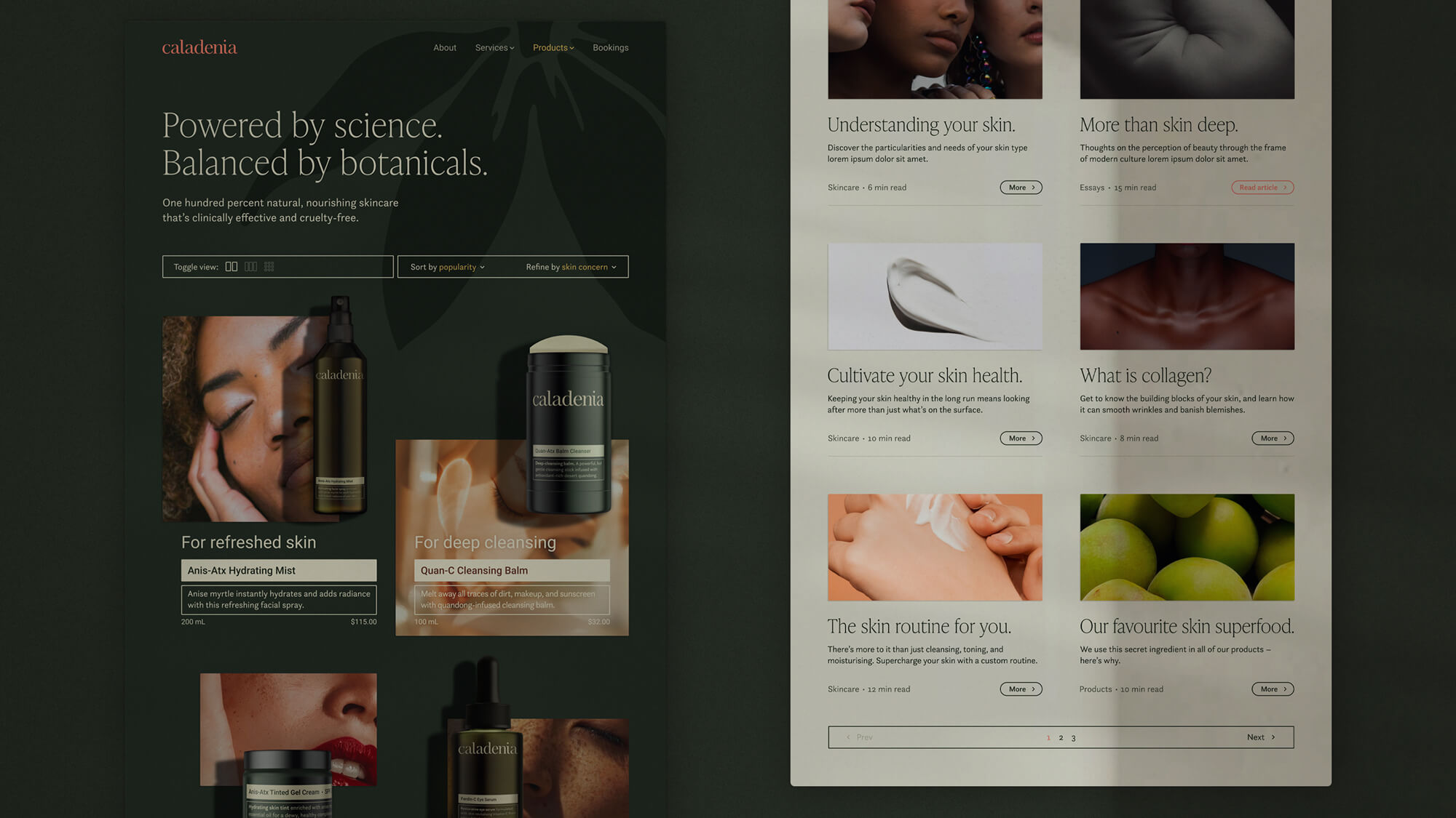
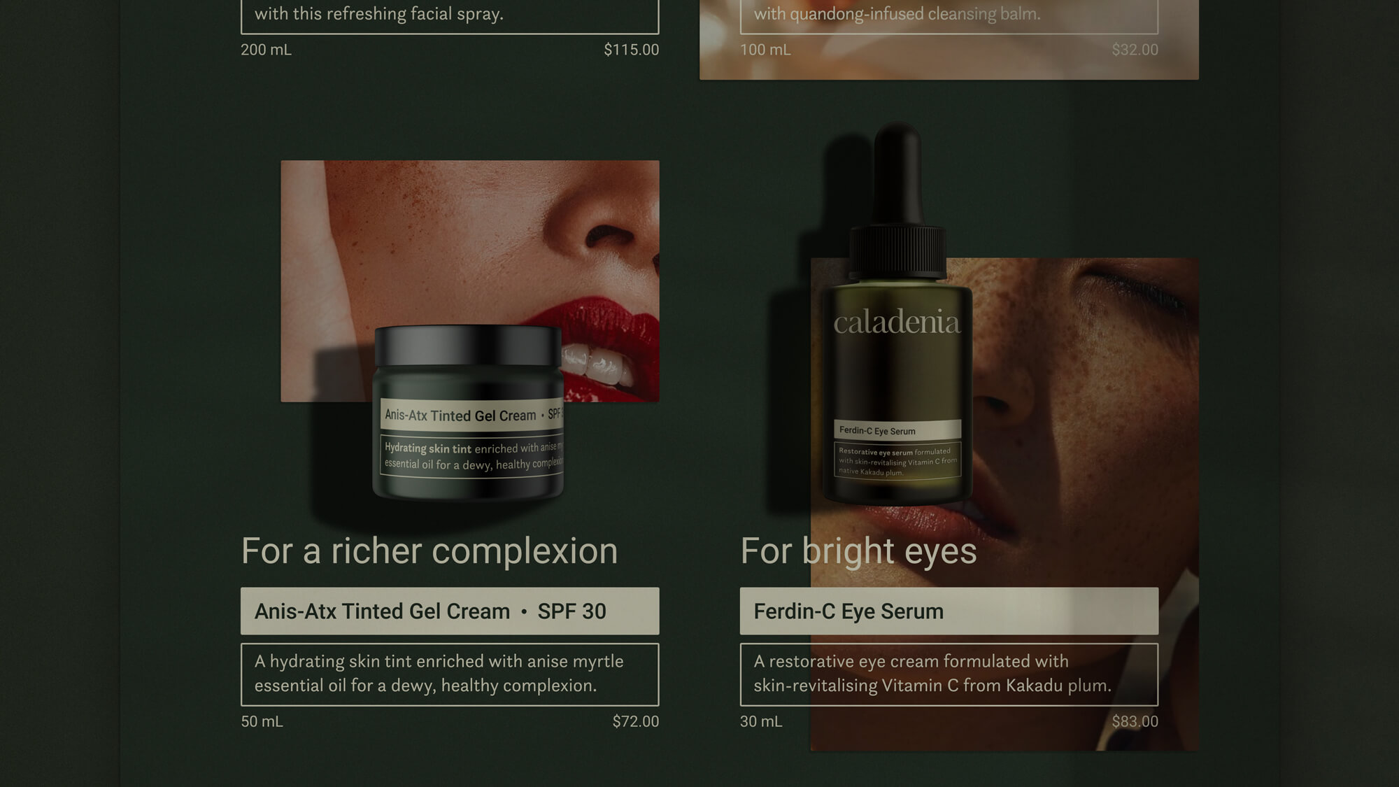
The Caladenia website seeks to bring an immersive experience; the product range is presented as if it were tangibly positioned in front of the user, dispelling the conventional grid structure of an online shop.
Like what you see?
Let's create something great together: