Utepils Craft Brewery
Utepils is an exploration of the surrounding landscape; a distillation of balmy summers on the beach, boundless wheat fields, and tranquil evenings under a glittering, star-studded sky.
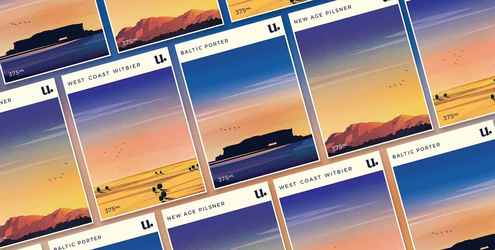
Paying homage to the background of founding partner Erik Nørgaard, the name and ethos of the brand emerge from the Norwegian word ‘utepils’ - a beer that is enjoyed outdoors.
The illustrative labels depict dreamy Western Australian landscapes: Two Rocks (the founding location of Utepils), the Wheatbelt, and the ranges of a local National Park.

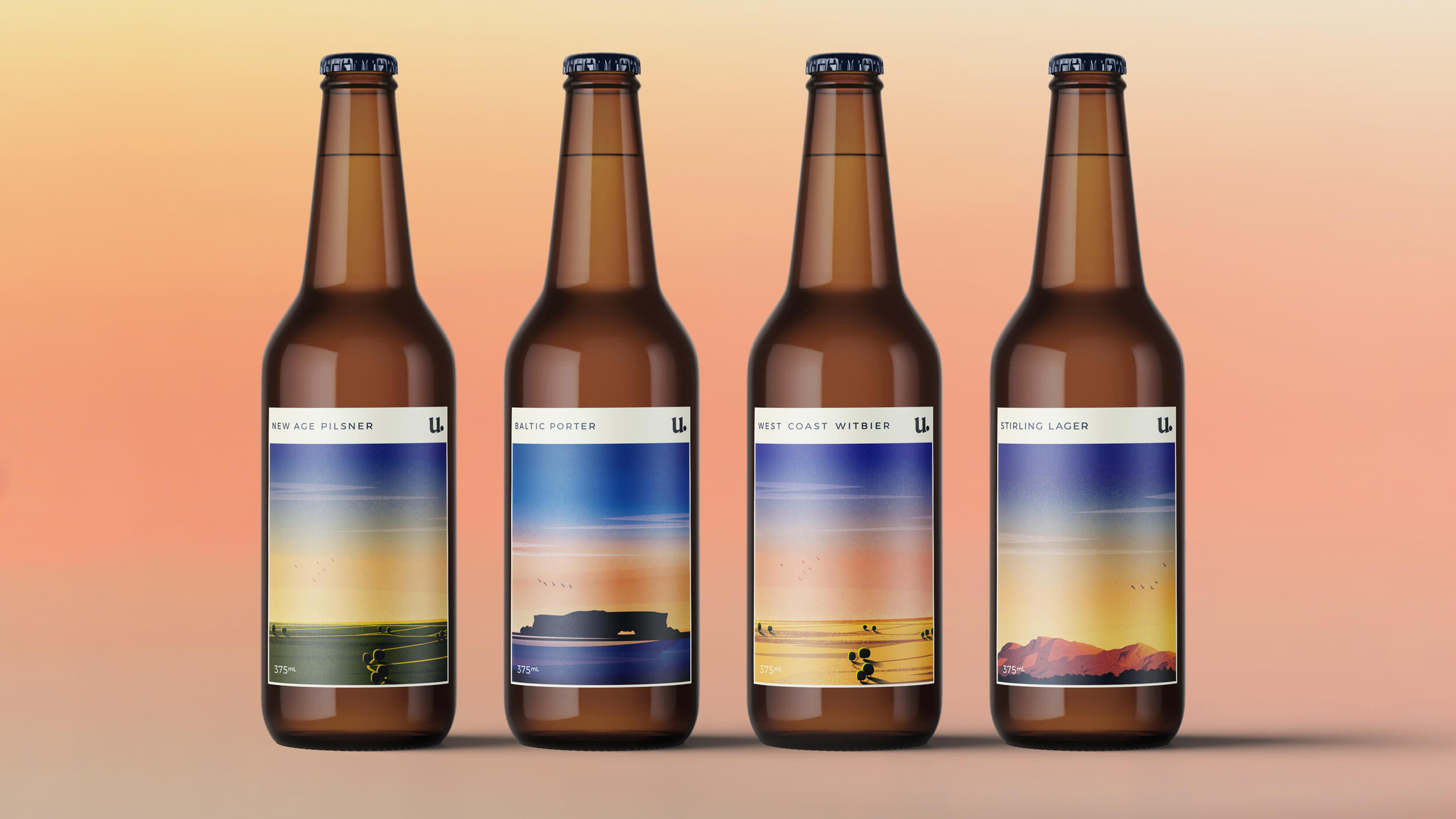
Minimal rectangular labels allude to that of wine packaging, encouraging consumers to appreciate the complexities and subtleties of its flavours as they would a good glass of wine.
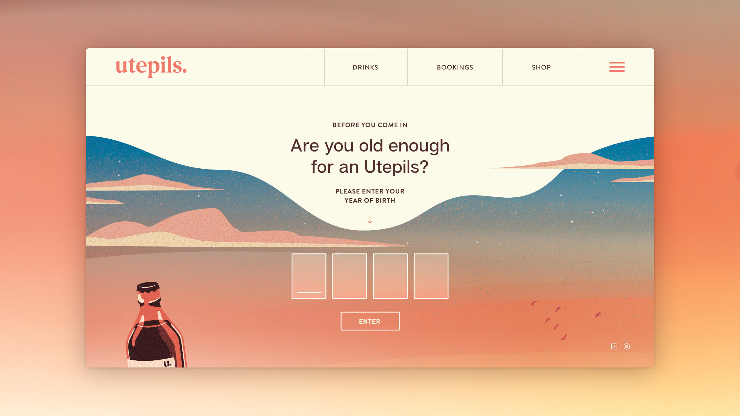
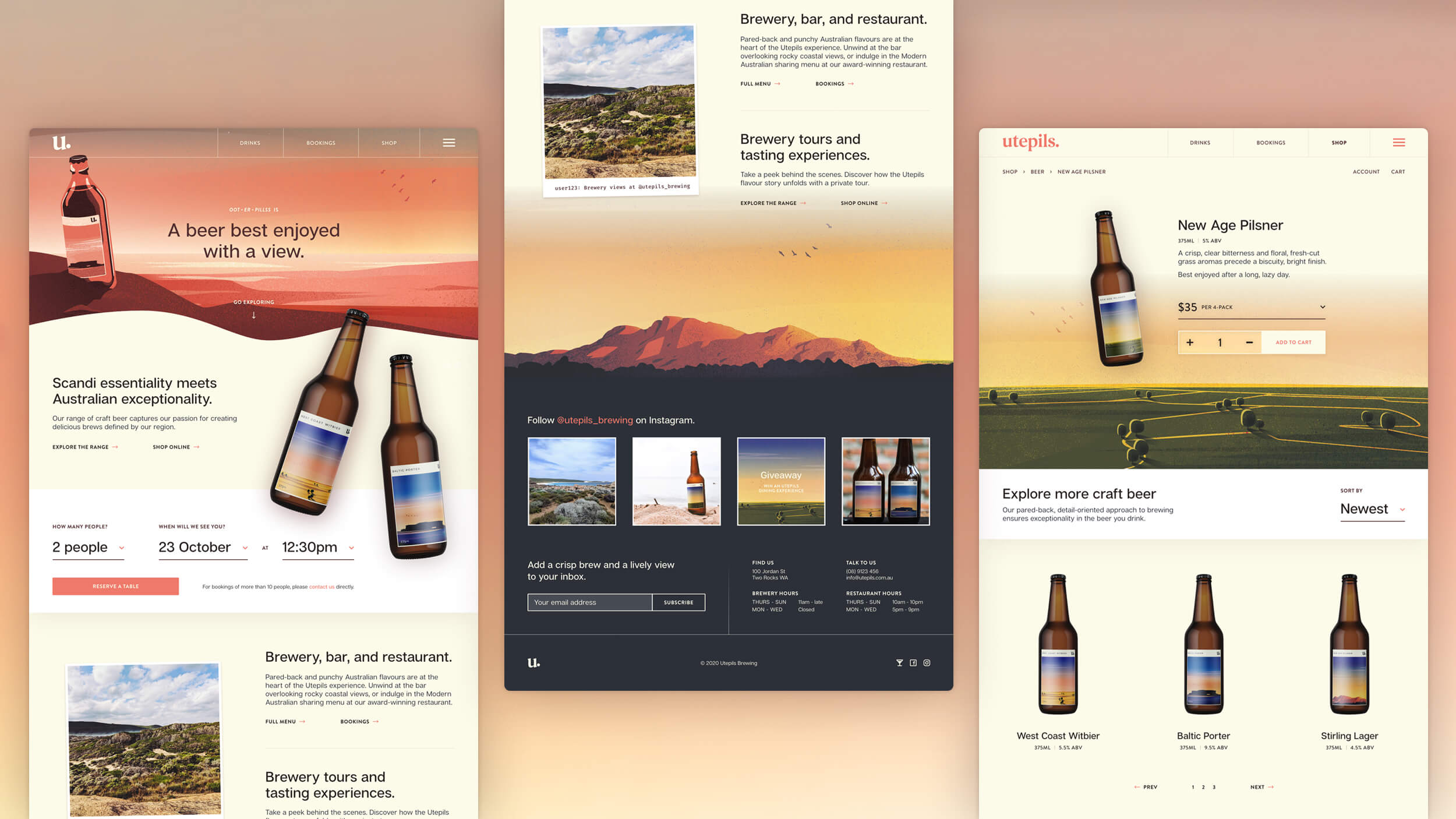
The Utepils website immediately places the user into an outdoor setting, giving center stage to the colour-soaked imagery of the brand.

Like what you see?
Let's create something great together: